Daniel Adebayo
Open to freelance work

Daniel Adebayo

Brand Designer & Ilustrator

Brand IdentityLogo DesignTypographyIllustrationVisual IdentityPackaging DesignEditorial DesignSocial Media DesignCreative DirectionArt Direction

About

A Brand Designer and Illustrator specializing in brand identity, logo design, typography, and illustration. I work with brands to build cohesive visual identities — from packaging and editorial design to social media and creative direction — with a focus on clarity, meaning, and visual impact. My goal is simple: to make your brand impossible to ignore.

Portfolio
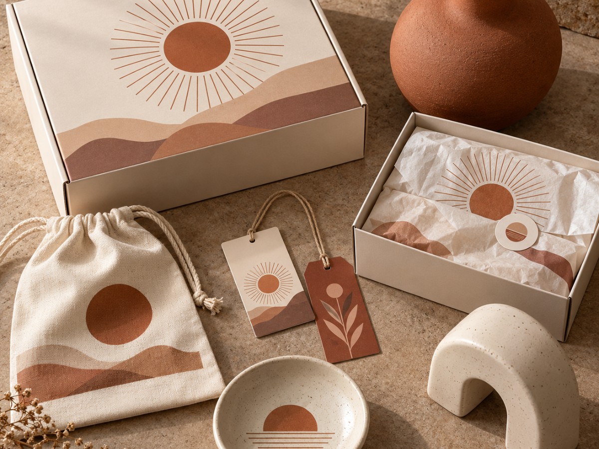
Nuru Home — Brand identity & packaging “A warm visual identity built around simple shapes, earthy colours, and packaging designed to feel at home in everyday spaces.”
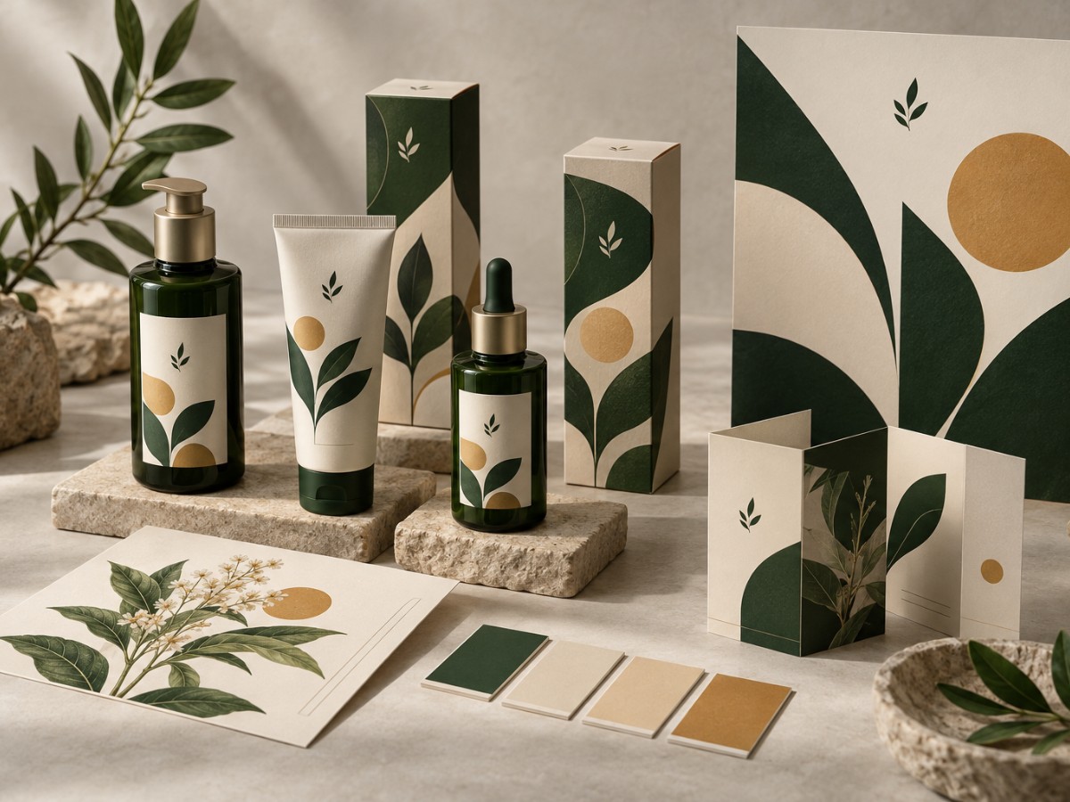
Adera Organics — Brand identity & product design “A botanical design system that brings the same calm, recognisable look to products, packaging, and printed materials.”
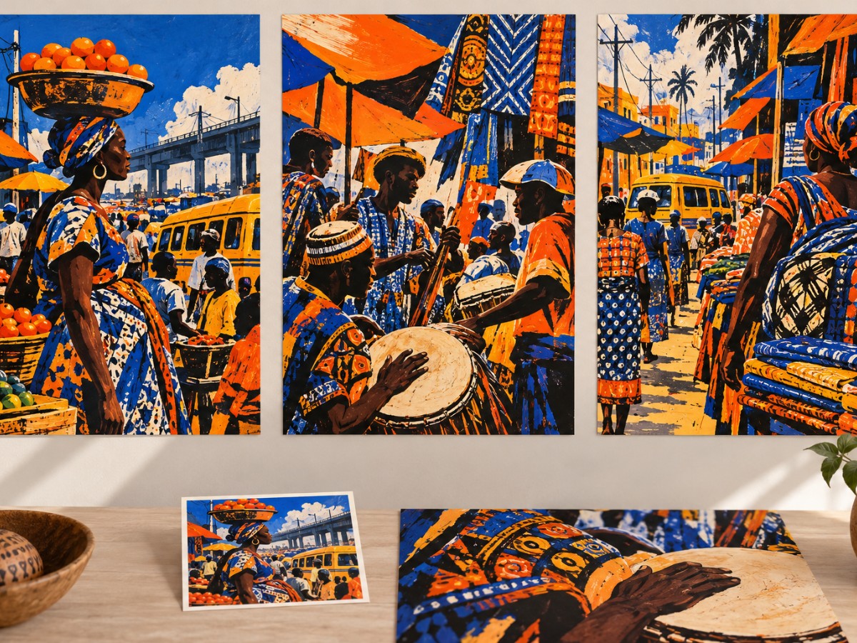
Market Rhythm — Editorial illustration “A colourful illustration series inspired by the movement, people, and energy of Lagos markets.”

Case studies

Homeware Brand Identity & Packaging-Nuru homeRead →
The problem

A concept homeware brand came to me needing an identity that felt warm without trying too hard. The brief was simple: grounded, considered, cohesive. No clutter, no noise.

The process

I explored sun and vessel forms — shapes that carry weight and domesticity without being literal. The palette landed on terracotta, cream, and earthy brown — colours that already feel like home. From there, I applied the system across boxes, tags, tissue paper, and a fabric bag, treating each touchpoint as part of a single visual conversation.

The outcome

Every item in the collection speaks the same visual language — pick up any piece and it belongs. That kind of consistency doesn't happen by accident. It's designed, deliberately, from the start.

Botanical Skincare Range — Packaging & Brand IdentityRead →
The problem

A concept botanical skincare range needed packaging that held together across multiple product formats — bottles, cartons, a leaflet, a poster. Without a clear visual system, the range would read as a collection of individual items rather than a coherent brand. The brief was simple: make it instantly recognisable.

The process

I built the visual identity around three things — leaf shapes, and a palette of forest green, cream, and ochre. Restrained, considered, and rooted in the natural world the brand was drawing from. I applied the system across every touchpoint to stress-test its consistency. When a visual language works, it holds at every scale.

The outcome

The finished range spans bottles, cartons, a leaflet, and a poster — each piece distinct in format, unified in feel. The identity is calm, coherent, and built to scale. Good packaging design doesn't just look right — it makes a brand impossible to confuse with anyone else.

Market Rhythm: A Lagos-Inspired Illustration SeriesRead →
The problem

Lagos markets are relentless — movement, color, sound, and texture colliding all at once. I wanted to capture that energy across a series of illustrations without flattening it into a single mood. The real challenge was keeping three distinct scenes feeling like they belonged together.

The process

I built the series around bold brushwork and a tight palette of blue, orange, and yellow — colors that echo the textiles and energy I was drawing from. Each piece centers on a different element: vendors, movement, music. The constraint of a shared palette did the connective work, so each scene could breathe on its own.

The outcome

The series became three large-format posters plus a collection of smaller printed pieces — six deliverables total, one cohesive world. Every piece holds its own and reads clearly as part of something larger. That balance between independence and continuity is exactly what I set out to achieve.

Services and rates

Brand identity
logo, palette, typography, and a concise style guide.
Packaging design
one product’s label or package design; additional products quoted separately
Editorial illustration
one illustration for a defined use; wider campaign use quoted separately.

Get in touch